Zepto: Simplifying the Grocery Shopping Experience with Quick Add Features — A UX Case Study
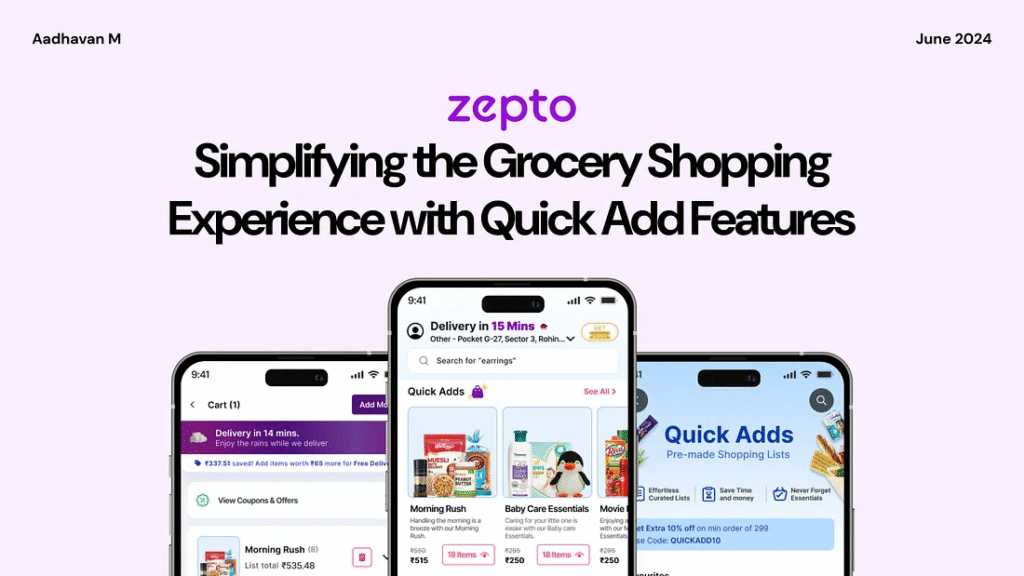
Feeling overwhelmed by the hassle of last-minute grocery shopping?
For many users, especially during last-minute events or busy schedules, grocery shopping can feel overwhelming. Scrolling through countless products, switching between categories, and manually selecting items often turn a simple task into a time-consuming chore. The process is not only tedious but also leaves room for frustration and missed essentials.
To solve this, I reimagined the shopping experience with a feature for pre-made shopping lists in the Zepto app, designed to streamline grocery shopping and bring convenience to the forefront.
Introducing a Smarter Way to Shop with Zepto!
Imagine a shopping experience that’s effortless, organized, and tailored to your needs. No more scrolling endlessly, juggling long lists, or struggling to find the right items under time pressure. With Zepto’s pre-made shopping lists, everything you need is just a click away.
Why this feature matters:
Let’s dive into the journey behind this feature — how I identified user pain points, explored design possibilities, and created a seamless solution to redefine the way users shop.
A Glimpse into a Lazy Sunday Morning Made Better with Zepto’s Quick Grocery Delivery
Meet Aravind, passionate home cook who loves crafting delicious meals from simple ingredients. On a sunny Sunday morning, he plans to prepare a hearty breakfast for his flatmates, only to find the pantry nearly empty. Instead of heading out to the store, Aravind turns to the Zepto app to quickly order groceries. Let’s explore his experience as he navigates the app, selects essentials for a quick breakfast, and discovers how Zepto simplifies his day while tackling any challenges along the way.
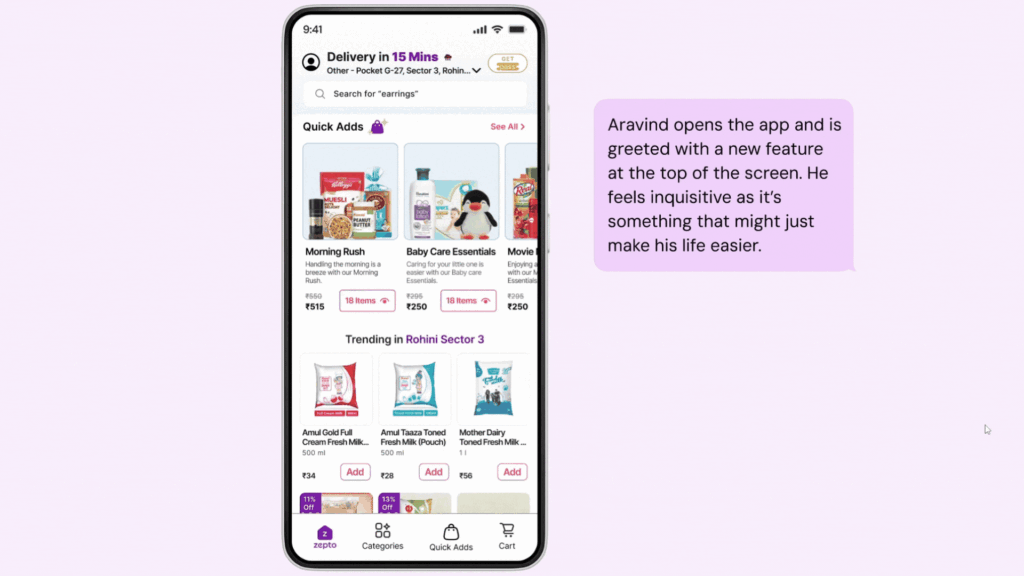
Behind the Scenes of Zepto’s Design: Simplifying Grocery Shopping for Every Home
What used to be a time-consuming task of browsing endless aisles or juggling multiple apps is now a breeze with Zepto. Every feature is thoughtfully designed to address real-life challenges, making grocery shopping quicker, smarter, and stress-free for users like Aravind, helping them enjoy their day without interruptions.
1. How Quick Adds Revolutionizes Zepto’s Home Screen Experience?
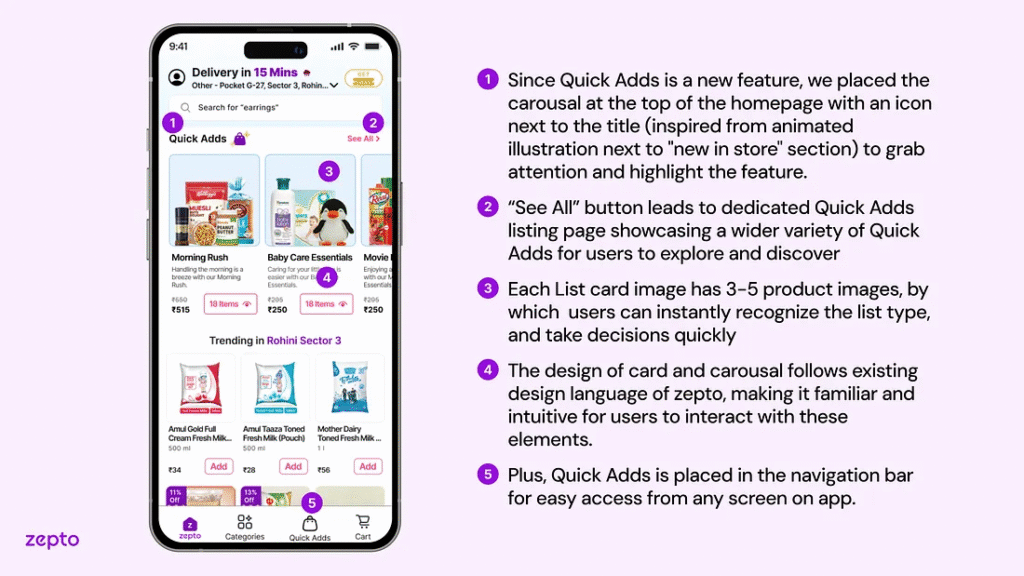
Designed to simplify shopping, Quick Adds is prominently placed on the home screen, showcasing pre-made lists like “Morning Rush” with 3–5 product images for instant recognition. The “See All” button leads to a wider selection, while its placement in the navigation bar ensures easy access from anywhere in the app, making shopping fast and intuitive.
2. Why Quick Adds Transforms Shopping into a Seamless Experience?
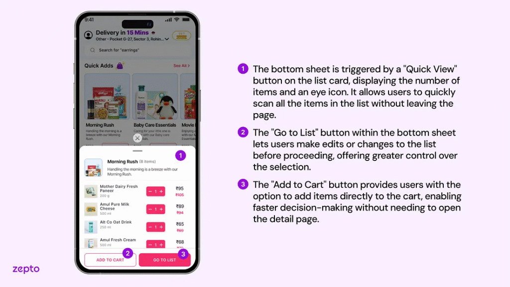
Focused on enhancing convenience, Quick Adds combines pre-made lists, categorized options, and a custom list feature accessible via a floating button. This design minimizes navigation, allowing users to explore, edit, or add items seamlessly through the Quick View bottom sheet, creating a faster, more intuitive, and hassle-free shopping experience!
3. How Thoughtful Design Choices Empower Users in List Detail Screens?
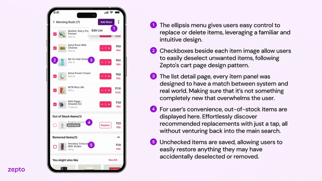
Rooted in familiar design patterns, the ellipsis menu empowers users to edit, replace, or delete items effortlessly. With checkboxes for quick deselection, a “Replace” option, and a Removed Items section for added flexibility, this streamlined design ensures a simple and seamless shopping experience.
4. How Suggestions Elevate the Custom List Experience?
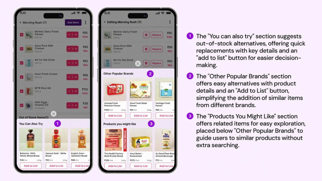
Tailored for user convenience, the “You Can Also Try” section provides quick replacements for out-of-stock items, while “Other Popular Brands” and “Products You Might Like” highlight similar and related items effortlessly. These features deliver a smooth and personalized shopping experience, reducing complexity.
5. How Smart Editing Enhances List Management for Busy Users?
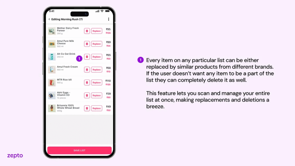
Built for efficient list management, the editing screen lets users quickly replace items with alternatives or delete unnecessary ones. Features like the “Replace” button for out-of-stock products and the ability to manage the entire list at once ensure seamless customization, simplifying tasks and reducing friction.
6. How Expandable List Sections Enhance Usability on the Cart Screen?
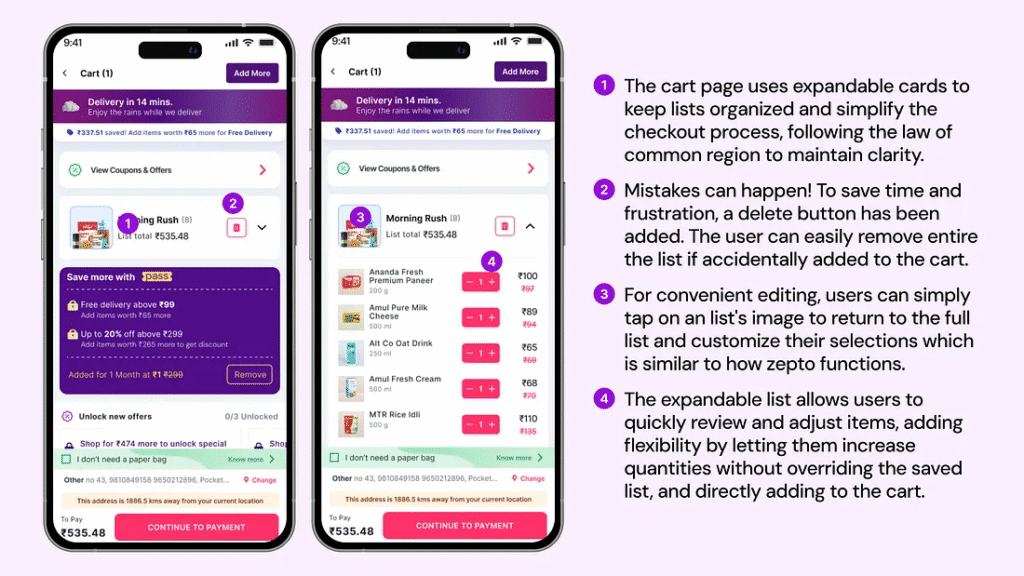
Inspired by user-centered design, expandable list sections on the cart screen allow users to easily scan items and make quick adjustments. Features like an intuitive delete button and the ability to edit quantities or return to the list ensure seamless control, maintaining Zepto’s familiar and organized design.
Inside Zepto’s Design: Transforming Grocery Shopping into an Effortless Experience
With Zepto, thoughtful design choices revolutionized the way users shop. Features like Quick Adds and customized lists were crafted to reduce friction, streamline navigation, and offer a seamless shopping journey, empowering users to save time and shop smarter.
1. How Pain Point Exploration Defined Zepto’s Quick Adds Feature?
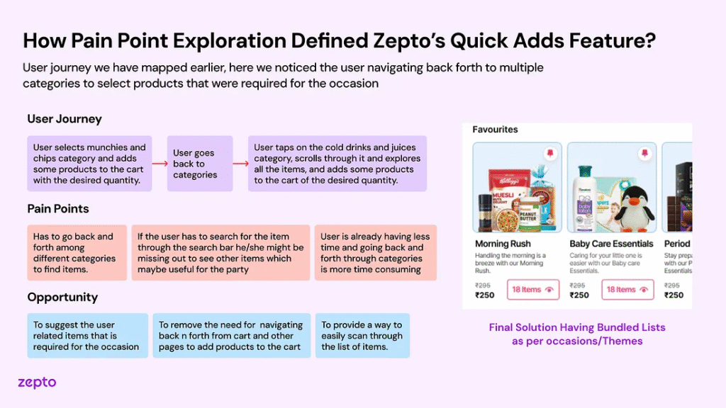
By uncovering user frustrations like navigating back and forth between categories and forgetting items due to time pressure, I identified a key pain point. This led to the creation of Quick Adds — bundled lists based on themes and occasions, enabling users to add items effortlessly. The result is a streamlined and intuitive shopping experience that addresses real user needs.
2. How User Habits Inspired Zepto’s Custom List Feature?
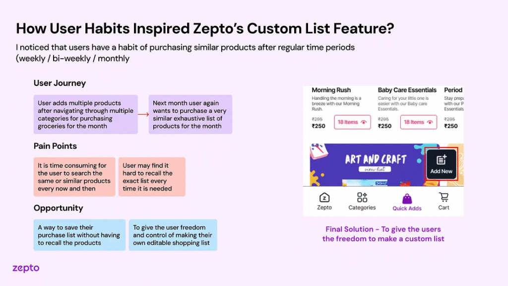
Realizing the inefficiency of manual list creation for repeated purchases, I introduced the Custom List feature. This allows users to save and edit shopping lists, streamlining the process and providing control and flexibility. By aligning with user habits, it simplifies recurring shopping and ensures a more user-friendly experience.
3. Why User Feedback Guided Zepto’s Transition to List View?
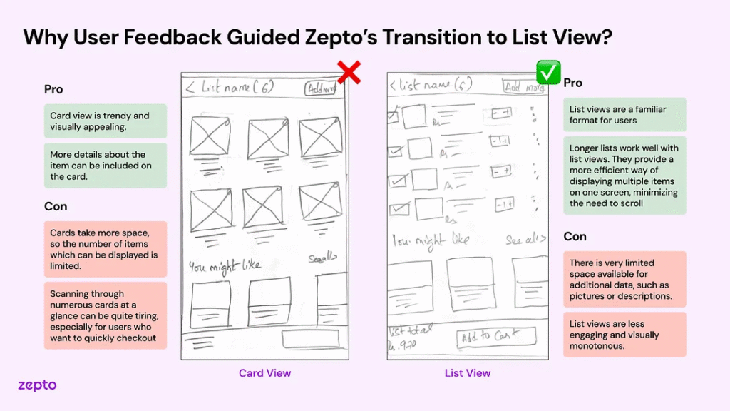
Starting with user testing and team feedback, I realized the List View better suits real-world shopping behaviors than the more visually appealing Card View. By focusing on functionality and scannability, the design enables users to view more products at once, creating a seamless and efficient experience that prioritizes usability over aesthetics.
4. How Iterative User Testing Shaped Pre-Made Shopping List Design?
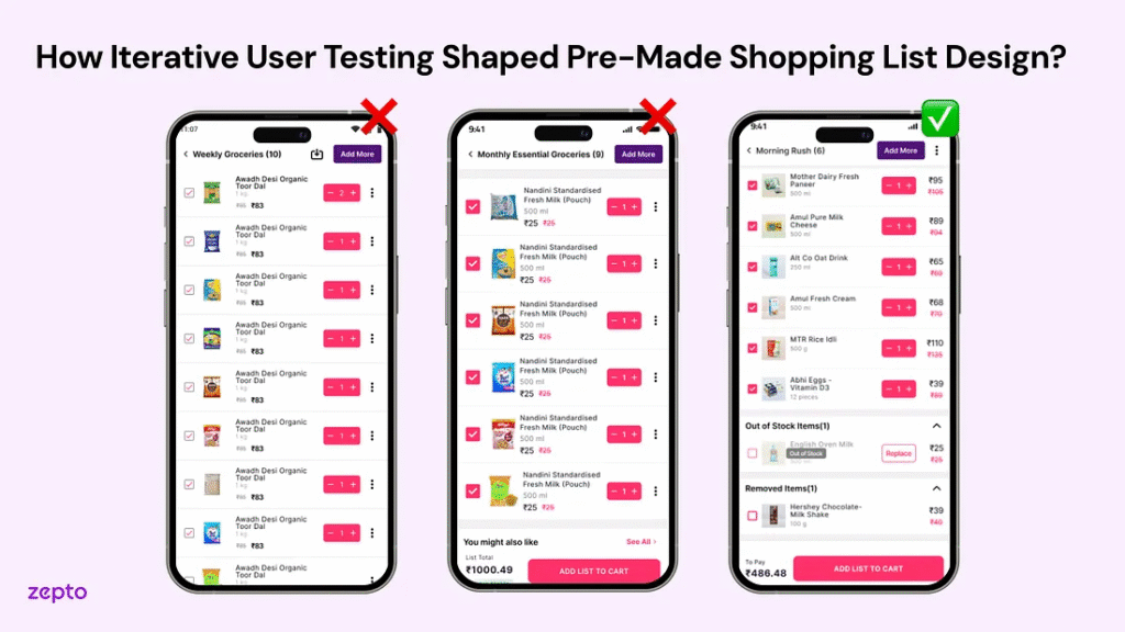
Driven by user insights, I identified that the ‘Save’ button added unnecessary complexity and lacked usability. It was replaced with clearer options like ‘Add List to Cart’, while adding features like an ‘Out of Stock’ section with ‘Replace’ options and a ‘Removed Items’ section for flexibility. These refinements ensured a more intuitive and user-centered shopping experience.
Designing Zepto’s Shopping Experience: Simplicity Meets Functionality
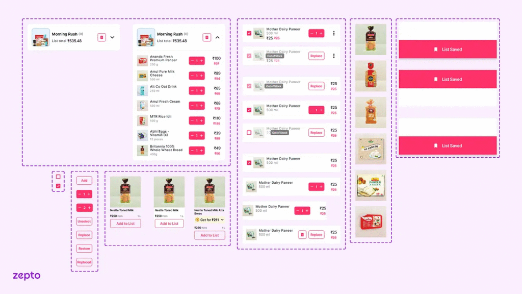
Zepto’s interface was designed to blend functionality with a seamless user experience, featuring clear text hierarchies, strategic color usage, and consistent elements like list cards and buttons. This cohesive design streamlines the shopping journey, making it intuitive, visually appealing, and highly engaging.
Crafting Zepto’s Evolution: Designing Simplicity for Effortless Shopping
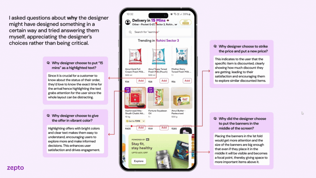
The integration of “Quick Adds” began by analyzing Zepto’s design through user goals, UI elements, and feedback mechanisms to identify usability improvements. Using Gestalt principles like proximity, the team reimagined visual structures to enhance navigation. This led to customizable pre-made lists, such as “Movie Night Munchies,” ensuring quick access and intuitive shopping. The approach prioritized efficiency and user alignment.
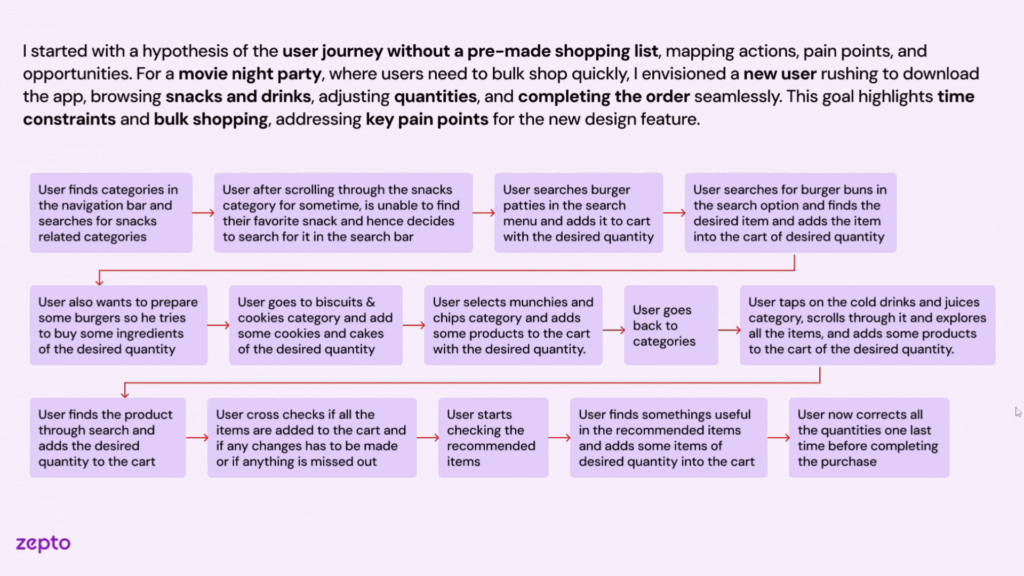
Building on this foundation, the integration of “Quick Adds” took shape by analyzing Zepto’s design through user goals, UI elements, and feedback mechanisms to pinpoint usability enhancements. Leveraging Gestalt principles like proximity, the team refined visual structures to ensure smooth navigation. This iterative process resulted in customizable pre-made lists, such as “Movie Night Munchies,” designed for quick access and intuitive shopping. The final solution prioritized efficiency, user alignment, and a seamless experience tailored to user needs.
The ideation process for “Quick Adds” involved brainstorming and sketching to enable quick iterations and collaboration. Key ideas like a floating icon, pinned categories, and bundled cart views were explored to enhance usability. The team finalized placing “Quick Adds” prominently on the home screen for visibility, with features like checkboxes for seamless management. This ensured a user-centered approach with intuitive navigation and efficiency.
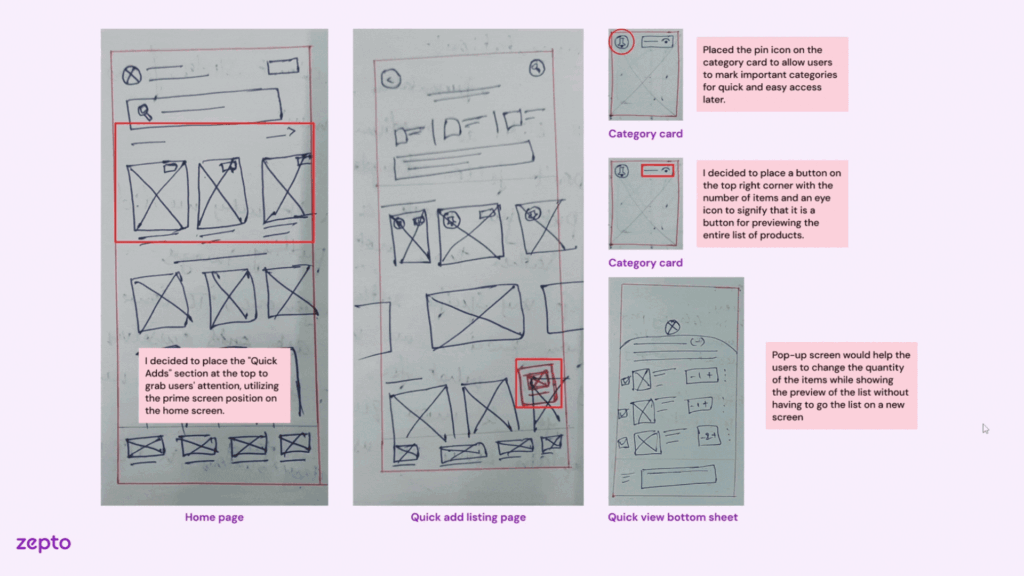
The ideation process for “Quick Adds” involved brainstorming and sketching ideas like a floating icon, pinned categories, and bundled cart views to enhance usability. These features ensured a user-centered approach with intuitive navigation and efficiency. After the ideation process, we moved to design, which is reflected in the Final Solution you’ve seen.
Lessons from Zepto: Crafting User-Centric Grocery Shopping Experiences
Working on Zepto taught me invaluable lessons about creating designs that resonate with real user behaviors while balancing innovation with practicality.
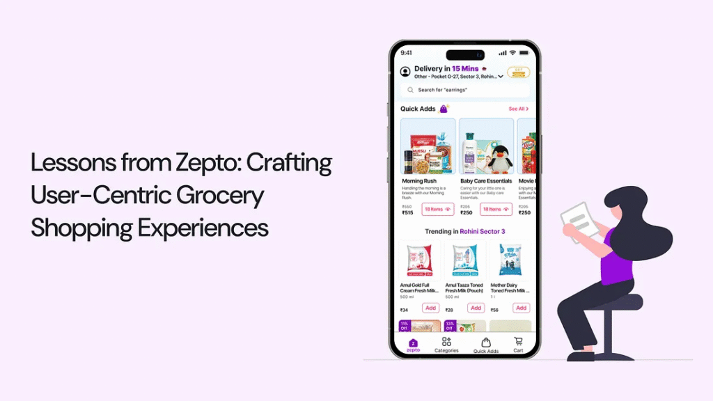
The Learning: Emphasizing ‘why’ revealed deeper root causes, while shifting to ‘how’ helped me ideate practical and impactful solutions that truly addressed user pain points.
The Learning: I discovered that prioritizing quality and feasibility over perfection, especially under tight deadlines, was essential for timely decision-making without compromising on core goals.
The Learning: Embracing feedback as a tool for refinement improved the overall quality of the project. Group alignment and iterative refinement allowed us to create a cohesive and well-thought-out solution.
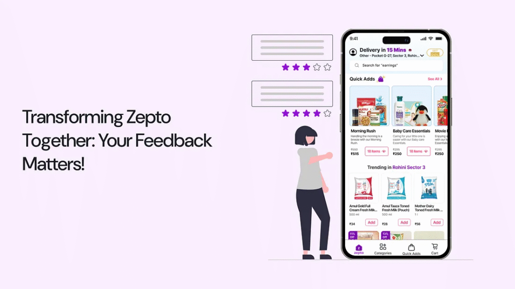
Transforming Zepto Together: Your Feedback Matters!
As I present the redesigned Zepto experience, I’d love to hear your thoughts! Your insights can help make this project even more user-focused and impactful.
Thank you so much for your time and thoughts! If you liked the project or have suggestions, connect with me via DM on social media ❤ — LinkedIn
Zepto: Simplifying the Grocery Shopping Experience with Quick Add Features — A UX Case Study

Feeling overwhelmed by the hassle of last-minute grocery shopping?
For many users, especially during last-minute events or busy schedules, grocery shopping can feel overwhelming. Scrolling through countless products, switching between categories, and manually selecting items often turn a simple task into a time-consuming chore. The process is not only tedious but also leaves room for frustration and missed essentials.
To solve this, I reimagined the shopping experience with a feature for pre-made shopping lists in the Zepto app, designed to streamline grocery shopping and bring convenience to the forefront.
Introducing a Smarter Way to Shop with Zepto!
Imagine a shopping experience that’s effortless, organized, and tailored to your needs. No more scrolling endlessly, juggling long lists, or struggling to find the right items under time pressure. With Zepto’s pre-made shopping lists, everything you need is just a click away.
Why this feature matters:
Let’s dive into the journey behind this feature — how I identified user pain points, explored design possibilities, and created a seamless solution to redefine the way users shop.
A Glimpse into a Lazy Sunday Morning Made Better with Zepto’s Quick Grocery Delivery
Meet Aravind, passionate home cook who loves crafting delicious meals from simple ingredients. On a sunny Sunday morning, he plans to prepare a hearty breakfast for his flatmates, only to find the pantry nearly empty. Instead of heading out to the store, Aravind turns to the Zepto app to quickly order groceries. Let’s explore his experience as he navigates the app, selects essentials for a quick breakfast, and discovers how Zepto simplifies his day while tackling any challenges along the way.

Behind the Scenes of Zepto’s Design: Simplifying Grocery Shopping for Every Home
What used to be a time-consuming task of browsing endless aisles or juggling multiple apps is now a breeze with Zepto. Every feature is thoughtfully designed to address real-life challenges, making grocery shopping quicker, smarter, and stress-free for users like Aravind, helping them enjoy their day without interruptions.
1. How Quick Adds Revolutionizes Zepto’s Home Screen Experience?

Designed to simplify shopping, Quick Adds is prominently placed on the home screen, showcasing pre-made lists like “Morning Rush” with 3–5 product images for instant recognition. The “See All” button leads to a wider selection, while its placement in the navigation bar ensures easy access from anywhere in the app, making shopping fast and intuitive.
2. Why Quick Adds Transforms Shopping into a Seamless Experience?

Focused on enhancing convenience, Quick Adds combines pre-made lists, categorized options, and a custom list feature accessible via a floating button. This design minimizes navigation, allowing users to explore, edit, or add items seamlessly through the Quick View bottom sheet, creating a faster, more intuitive, and hassle-free shopping experience!
3. How Thoughtful Design Choices Empower Users in List Detail Screens?

Rooted in familiar design patterns, the ellipsis menu empowers users to edit, replace, or delete items effortlessly. With checkboxes for quick deselection, a “Replace” option, and a Removed Items section for added flexibility, this streamlined design ensures a simple and seamless shopping experience.
4. How Suggestions Elevate the Custom List Experience?

Tailored for user convenience, the “You Can Also Try” section provides quick replacements for out-of-stock items, while “Other Popular Brands” and “Products You Might Like” highlight similar and related items effortlessly. These features deliver a smooth and personalized shopping experience, reducing complexity.
5. How Smart Editing Enhances List Management for Busy Users?

Built for efficient list management, the editing screen lets users quickly replace items with alternatives or delete unnecessary ones. Features like the “Replace” button for out-of-stock products and the ability to manage the entire list at once ensure seamless customization, simplifying tasks and reducing friction.
6. How Expandable List Sections Enhance Usability on the Cart Screen?

Inspired by user-centered design, expandable list sections on the cart screen allow users to easily scan items and make quick adjustments. Features like an intuitive delete button and the ability to edit quantities or return to the list ensure seamless control, maintaining Zepto’s familiar and organized design.
Inside Zepto’s Design: Transforming Grocery Shopping into an Effortless Experience
With Zepto, thoughtful design choices revolutionized the way users shop. Features like Quick Adds and customized lists were crafted to reduce friction, streamline navigation, and offer a seamless shopping journey, empowering users to save time and shop smarter.
1. How Pain Point Exploration Defined Zepto’s Quick Adds Feature?

By uncovering user frustrations like navigating back and forth between categories and forgetting items due to time pressure, I identified a key pain point. This led to the creation of Quick Adds — bundled lists based on themes and occasions, enabling users to add items effortlessly. The result is a streamlined and intuitive shopping experience that addresses real user needs.
2. How User Habits Inspired Zepto’s Custom List Feature?

Realizing the inefficiency of manual list creation for repeated purchases, I introduced the Custom List feature. This allows users to save and edit shopping lists, streamlining the process and providing control and flexibility. By aligning with user habits, it simplifies recurring shopping and ensures a more user-friendly experience.
3. Why User Feedback Guided Zepto’s Transition to List View?

Starting with user testing and team feedback, I realized the List View better suits real-world shopping behaviors than the more visually appealing Card View. By focusing on functionality and scannability, the design enables users to view more products at once, creating a seamless and efficient experience that prioritizes usability over aesthetics.
4. How Iterative User Testing Shaped Pre-Made Shopping List Design?

Driven by user insights, I identified that the ‘Save’ button added unnecessary complexity and lacked usability. It was replaced with clearer options like ‘Add List to Cart’, while adding features like an ‘Out of Stock’ section with ‘Replace’ options and a ‘Removed Items’ section for flexibility. These refinements ensured a more intuitive and user-centered shopping experience.
Designing Zepto’s Shopping Experience: Simplicity Meets Functionality
Zepto’s interface was designed to blend functionality with a seamless user experience, featuring clear text hierarchies, strategic color usage, and consistent elements like list cards and buttons. This cohesive design streamlines the shopping journey, making it intuitive, visually appealing, and highly engaging.

Crafting Zepto’s Evolution: Designing Simplicity for Effortless Shopping
The integration of “Quick Adds” began by analyzing Zepto’s design through user goals, UI elements, and feedback mechanisms to identify usability improvements. Using Gestalt principles like proximity, the team reimagined visual structures to enhance navigation. This led to customizable pre-made lists, such as “Movie Night Munchies,” ensuring quick access and intuitive shopping. The approach prioritized efficiency and user alignment.

Building on this foundation, the integration of “Quick Adds” took shape by analyzing Zepto’s design through user goals, UI elements, and feedback mechanisms to pinpoint usability enhancements. Leveraging Gestalt principles like proximity, the team refined visual structures to ensure smooth navigation. This iterative process resulted in customizable pre-made lists, such as “Movie Night Munchies,” designed for quick access and intuitive shopping. The final solution prioritized efficiency, user alignment, and a seamless experience tailored to user needs.

The ideation process for “Quick Adds” involved brainstorming and sketching to enable quick iterations and collaboration. Key ideas like a floating icon, pinned categories, and bundled cart views were explored to enhance usability. The team finalized placing “Quick Adds” prominently on the home screen for visibility, with features like checkboxes for seamless management. This ensured a user-centered approach with intuitive navigation and efficiency.

To enhance usability, I began exploring ideas for the “Quick Adds” feature through brainstorming and sketching concepts like a floating icon, pinned categories, and bundled cart views. These features ensured a user-centered approach with intuitive navigation and efficiency. After the ideation process, we moved to design, which is reflected in the Final Solution you’ve seen.
Lessons from Zepto: Crafting User-Centric Grocery Shopping Experiences
Working on Zepto taught me invaluable lessons about creating designs that resonate with real user behaviors while balancing innovation with practicality.

The Learning: Emphasizing ‘why’ revealed deeper root causes, while shifting to ‘how’ helped me ideate practical and impactful solutions that truly addressed user pain points.
The Learning: I discovered that prioritizing quality and feasibility over perfection, especially under tight deadlines, was essential for timely decision-making without compromising on core goals.
The Learning: Embracing feedback as a tool for refinement improved the overall quality of the project. Group alignment and iterative refinement allowed us to create a cohesive and well-thought-out solution.
Transforming Zepto Together: Your Feedback Matters!
As I present the redesigned Zepto experience, I’d love to hear your thoughts! Your insights can help make this project even more user-focused and impactful.

Thank you so much for your time and thoughts! If you liked the project or have suggestions, connect with me via DM on social media ❤ — LinkedIn
