Design Systems
Created and implemented a scalable design system in Expenzo – ensured visual consistency, component reusability, and faster screen-level iterations using Material 3 Design Kit.
For Expenzo, I designed and documented a complete design system using Figma and Material 3 Design Kit as the foundation. This helped ensure consistency across all screens and simplified the design-to-development handoff.
What I did:
1. Started with Material 3 Design Kit to align with current Android design principles.
2. Customized the kit to create Expenzo-specific tokens and components.
3. Defined atomic components:
– Buttons: primary, secondary, icon-based
– Inputs: default, with prefix/suffix icons, error/success states
– Cards: for receipts, summaries, and export previews
– Chips, toggles, modals for interaction elements
– Buttons: primary, secondary, icon-based
– Inputs: default, with prefix/suffix icons, error/success states
– Cards: for receipts, summaries, and export previews
– Chips, toggles, modals for interaction elements
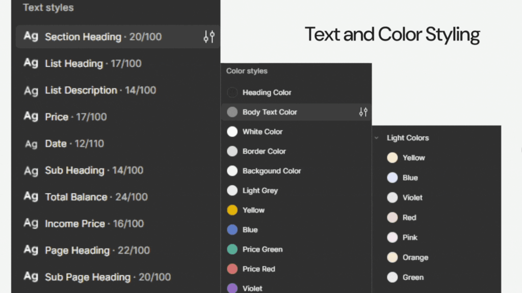
4. Built a typography system with clearly defined hierarchy for headers, subtext, and labels.
5. Created a grid and spacing system for consistent layout behavior.
6. Maintained color tokens for light and dark themes, GST categories, and alert states.
7. Documented use cases, states, and dos/don’ts in the Figma file for developer reference.
This system made it easier to maintain consistency during iterations, onboard teammates faster, and ensure UI logic was clear during prototype handoffs.
Case Study: Expenzo Project
Visual Reference:

