Information Architecture
Organized user input flows in a fitness onboarding journey to minimize form fatigue – simplified screens helped users reach personalized suggestions faster.
In the Fitzen AI Fitness App challenge, I led the planning and structuring of the onboarding journey to ensure users shared relevant fitness data without dropping off due to overwhelm.
What I did:
– Age, weight, gender
– Current activity level
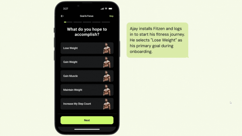
– Fitness goals (e.g., weight loss, strength)
– Workout preferences (home/gym, equipment availability)
– Dietary preferences and health constraints
– Step 1: Personal details
– Step 2: Lifestyle habits (sleep, screen time, activity)
– Step 3: Fitness goals
– Step 4: Workout preferences
– Step 5: Health & dietary restrictions
– Only 2-3 questions per screen
– Step indicator at top to show progress
– Added descriptions below each question for clarity (e.g., “We ask this to recommend intensity levels that suit your lifestyle.”)
– If users chose “Home workout only,” skipped gym-related steps
– If users selected “Beginner,” displayed beginner-focused workout preferences
This improved clarity, reduced form fatigue, and helped users finish onboarding in under 90 seconds. It also ensured that the backend received quality inputs to deliver relevant, high-quality fitness plans.
Case Study: Fitzen Project
Visual Reference:

