Interaction Design
Designed fluid interactions across Expenzo’s core workflows – improved task completion efficiency for expense tracking, scanning, and exporting, especially for first-time and non-tech-savvy users.
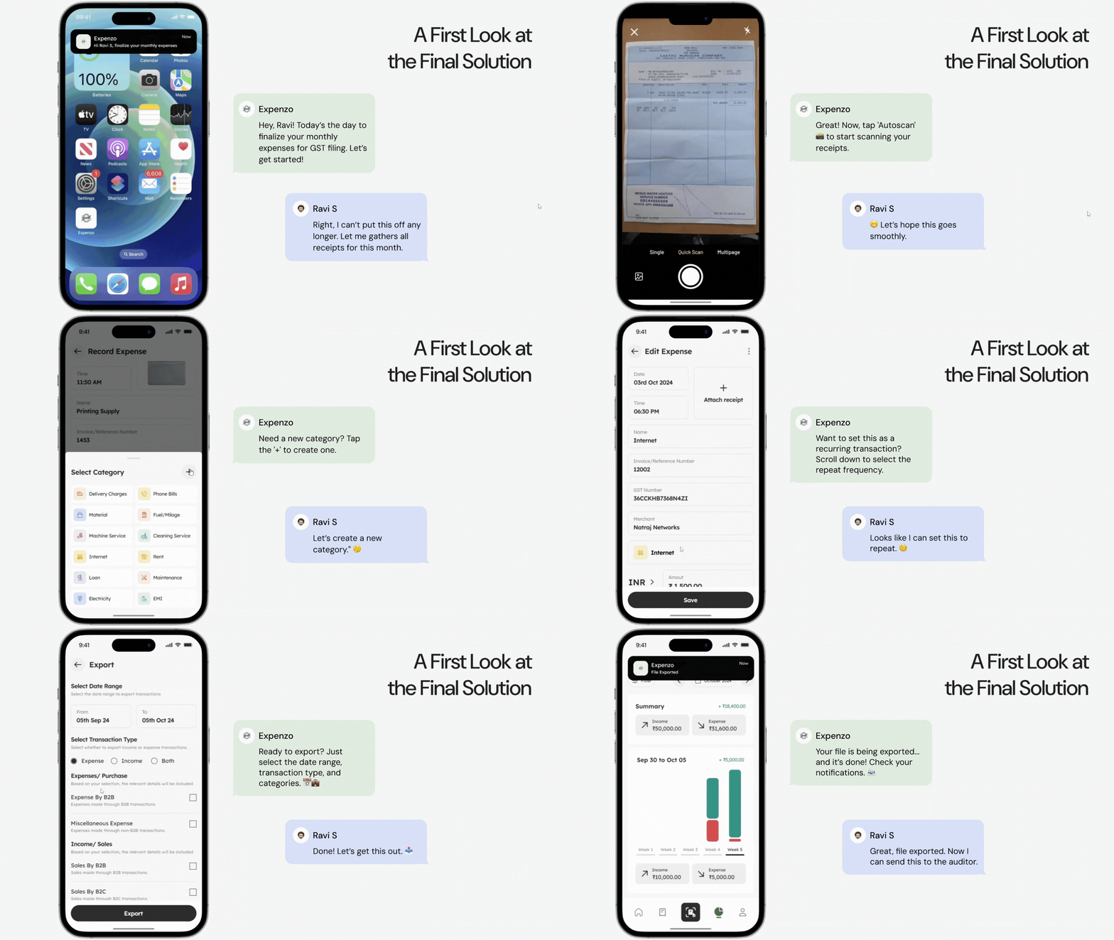
In Expenzo, interaction design played a central role in ensuring that small business owners could manage their financial data with ease. Many users relied on manual ledgers or Excel, so reducing friction and guiding them with subtle cues was essential.
What I designed:
– Opened the phone camera with framing guide to assist with alignment.
– Auto-captured receipts once properly framed, reducing button dependency.
– Animated bar to show progress of text recognition.
– Provided visual cues when OCR failed to extract key data.
– Allowed users to immediately adjust amount, date, and category on the same screen.
– Used color-coded highlights to show system-suggested vs. manually edited fields.
– Swipe gesture on transaction cards to mark them as recurring.
– Displayed confirmation chip with animation to show it’s been added to recurring list.
– Tactile-like microinteractions on save, delete, or export actions.
– Shimmer effects during loading and soft success indicators to reassure completion.
These patterns were tested through usability sessions and iterations. I discovered that users were more confident when they saw direct responses to their actions—like a subtle tick or highlight after saving. The goal was not to impress users with motion but to make the workflow feel natural and dependable.
Case Study: Expenzo Project
Visual Reference:

