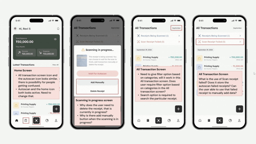
Usability Testing
Tested Expenzo app with 3 personas – feedback helped refine onboarding, export screens, and error handling.
After completing Expenzo’s initial design, I tested it with three representative user types:
1. First-time digital user.
2. Finance-savvy user.
3. Moderate user with basic tech skills.
What I did:
1. Designed a usability test with clear task scenarios:
– Scan and categorize a receipt
– Add a recurring expense
– Export last month’s GST transactions
– Scan and categorize a receipt
– Add a recurring expense
– Export last month’s GST transactions
2. Conducted in-person and remote tests, where I:
– Observed users’ screen behavior
– Asked them to think aloud as they completed tasks
– Noted friction points and hesitation patterns
– Observed users’ screen behavior
– Asked them to think aloud as they completed tasks
– Noted friction points and hesitation patterns
3. Common issues found:
– Difficulty finding the “Export” button
– Uncertainty about whether a scanned receipt was saved
– Confusion over recurring transaction tagging
– Difficulty finding the “Export” button
– Uncertainty about whether a scanned receipt was saved
– Confusion over recurring transaction tagging
Based on insights:
1. Simplified navigation by reducing steps for key flows
2. Renamed actions more clearly (e.g., “Save & Export” instead of just “Export”)
3. Added visual confirmation after key actions (scan saved, export success)
4. Introduced microcopy below ambiguous elements
5. Used onboarding tooltips to educate first-time users
Based on insights:
1. Time taken to complete primary tasks reduced significantly after refinements
2. First-time users completed 4 out of 5 tasks without assistance
3. Finance-savvy testers appreciated how the export aligned with their CA workflows
This process reinforced that even small interaction improvements can greatly affect user confidence, especially when designing for non-tech-savvy business users.
Case Study: Expenzo Project
Visual Reference:

