Visual Design (UI Design)
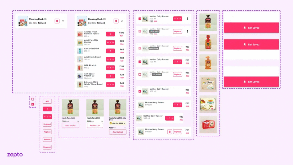
Redesigned Zepto’s Quick Add experience – focused on visual clarity, interaction speed, and mobile responsiveness to align with Zepto’s promise of instant grocery delivery.
For the Zepto redesign, my focus was to ensure that the Quick Add feature looked clean, intuitive, and did not slow down the user while they were adding multiple grocery items.
What I did:
1. Designed the Quick Add panel as a horizontally scrollable section at the top of the homepage.
2. Maintained strict visual hierarchy:
– Product name in bold
– Variant and price in subdued font
– Add button made sticky and primary-colored for faster actions
– Product name in bold
– Variant and price in subdued font
– Add button made sticky and primary-colored for faster actions
3. Ensured spacing followed an 8pt grid for mobile adaptability.
4. Created UI patterns that required minimal reading effort – included product thumbnails, badges for discounts, and tap-friendly + buttons.
5. Handled states like:
– Out-of-stock (greyed out + overlay label)
– Added state (turned green with subtle confirmation animation)
– Out-of-stock (greyed out + overlay label)
– Added state (turned green with subtle confirmation animation)
6. Followed platform design guidelines (Material 3 principles), adapted to Zepto’s brand tone.
7. Used shadows and elevation minimally to maintain visual lightness and avoid clutter.
The final design not only made it easier to add items quickly but also visually fit with Zepto’s identity of being fast, simple, and efficient.
Case Study: Zepto Project
Visual Reference:

