Wireframing
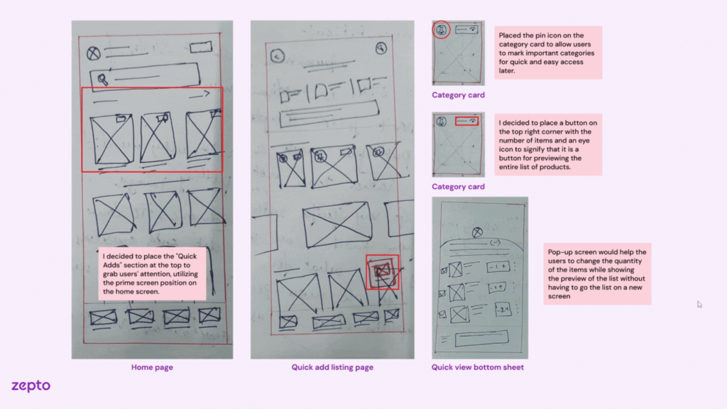
Sketched and tested multiple wireframe structures for Zepto’s Quick-Add Feature – enabled usability feedback loops before moving to high-fidelity design.
During the Zepto case study, my focus was to help users quickly add frequently purchased items without interrupting their primary shopping flow. This required wireframing a lightweight yet visible module that balanced utility with simplicity.
What I did:
– Horizontal scrollable chip-style product cards at the top of homepage
– Static grid below the fold with 2-click add-to-cart
– Product card layout with image, short name, price, and + button
– Badge overlays for offers or out-of-stock status
– Optional CTA to view all frequently purchased items
– Users preferred the top placement for faster access
– Some found the horizontal scroll easy to miss, so I added a label to draw attention
– Ensured tap target size met mobile accessibility guidelines
These wireframes helped catch early confusion around visual hierarchy and placement. It saved time before jumping into detailed UI styling and allowed quick changes based on user feedback.
Case Study: Zepto Project
Visual Reference:

